


Linkedin says that profiles with a headshot get 21x more profile views however, the deliberate use of colour can take your headshot to a whole new level.
When it comes to creating a perfect headshot, an often overlooked component is the selection colour to complement yourself, your brand or both.
Correct use of colour can make you appear slimmer, more confident, empathetic, trustworthy and in many cases more relatable.
With over a decade of experience in personal branding, at Hero Shot Photography we understand the critical role colours play in enhancing the impact of a professional headshot.
Read below to find out how you can use colour theory and colour psychology for maximum impact in your next headshot.
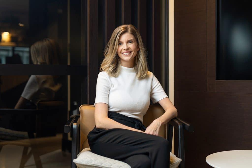
1. Neutral or Solid Colours
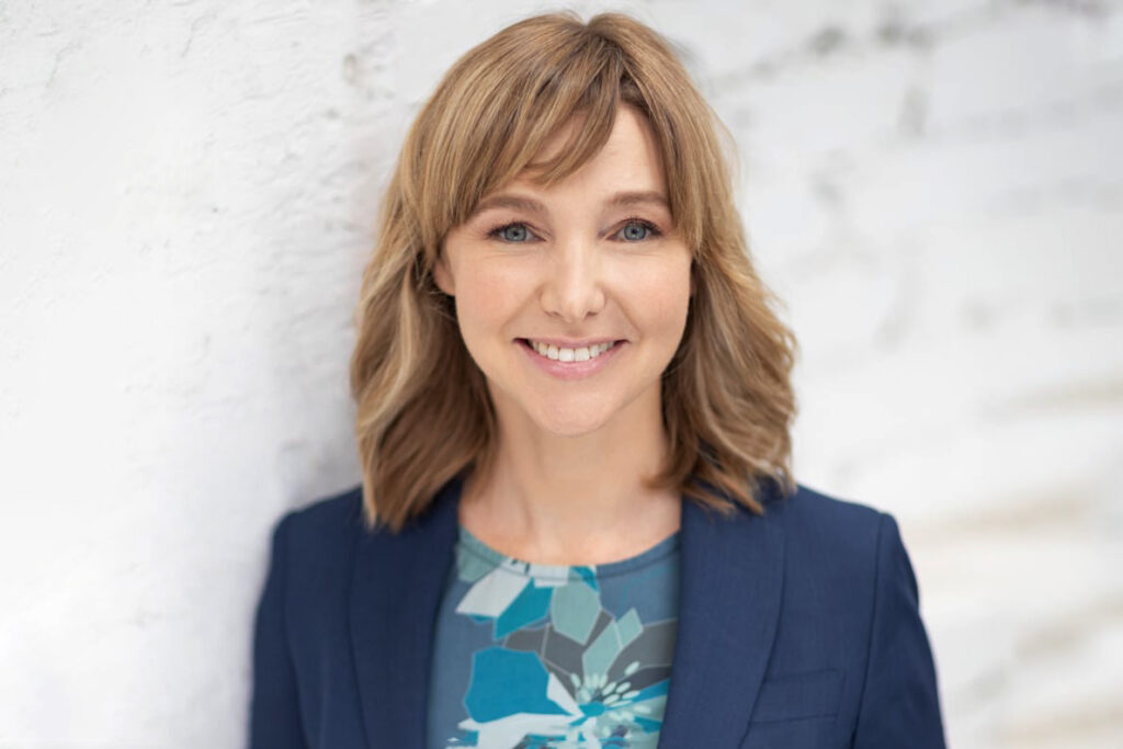
Solid and neutral colours always work well as the eye is used to seeing them and they have little chance of overwhelming the frame. Light neutral shades include white and cream, while dark ones include navy and black.
Neutrals are timeless, non-competing and emotionless.
They can either be used alone for a soft understated look or as a base colour along another colour palette as they will go well with most other colours.
As neutrals don’t evoke emotion of their own, they can also help to highlight an expression or smile.


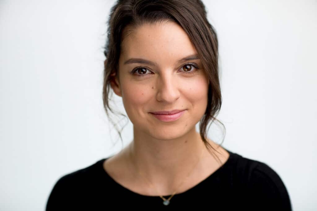
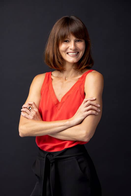
2. Bold Shades around the Neckline
Darker shades surrounding the neckline, such as the lapel of a blazer or the neckline of a top itself will help you draw focus to the face. This is often advised over wearing a distinctive necklace, which will normally compete for attention instead of directing attention elsewhere.


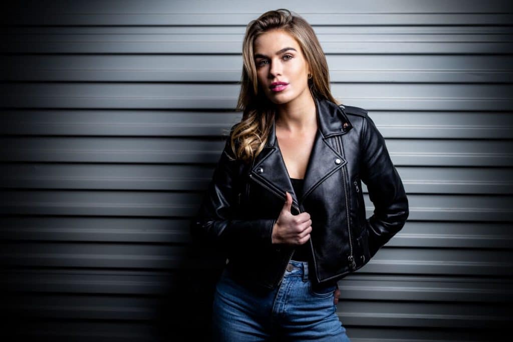


3. Classics Always Rock
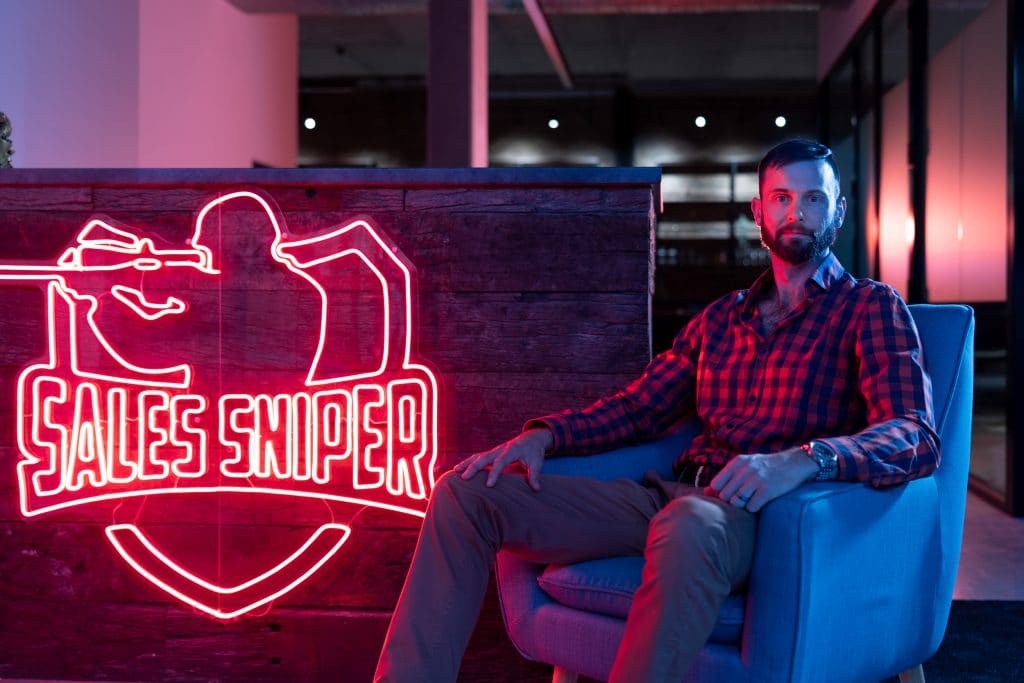
Classic business clothing options for a professional headshot, such as navy, blue, black and dark grey look good on practically anyone. Classics, however, are very much industry dependent. Lawyers, financial services and other traditional, conservative industries tend to prefer understated, darker outer options whilst artists and designers are not so confined by a monochrome colour palette.


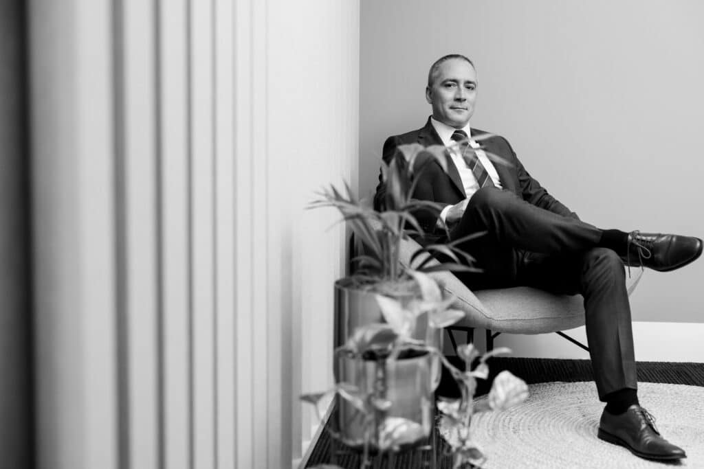
4. Black and White Photography
If you plan to use black and white photography, we recommend you to opt for contrasting colours and tonality. For example, a bright, white-coloured shirt with tie and navy-blue blazer will work well.
A pastel top with a light grey jacket won’t translate so well into black and white due to the lack of contrast.
Once colour has been removed from the image, the tonality of the clothing will also be more like the skin tone so it will lack overall punchiness.


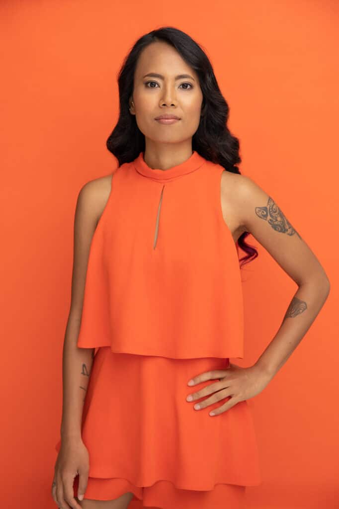
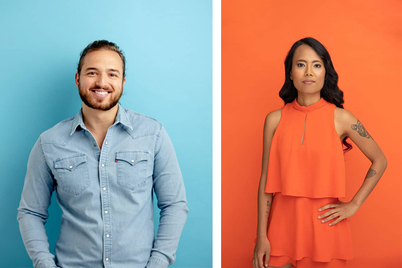
5. Deeper Colours Pop
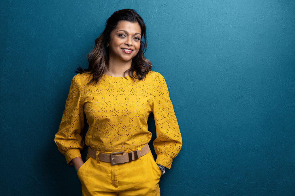
Instead of picking white, yellow, and other pale colours, for outdoor headshot sessions, consider bringing some deep colours. They will help you reduce the amount of light reflecting from them and ensure you do not appear washed out.

6. Avoid Graphics and Patterns
We always recommend choosing a shirt or blouse of solid colours instead of something with a bold or graphic pattern. For branding photo shoots, it will help you highlight the company logos and slogans, and professional headshots will be more focused on the individual, without creating any distractions.
This isn’t to say that busy patterns can’t still be worked with, they just reduce your options both in terms of your shoot including backgrounds and final usage of the images. It’s therefore generally better bang for your investment to consider plainer options first.
*For group portraits, patterns are almost always best avoided

7. While Layering Wear Complementary Shades
Layers help to add more interest but make sure that the colour combinations that you wear when layering complement each other. We advise keeping the colour combinations simple.


Matching your eye colour with a similar dominant or secondary colour will also make for more visually appealing colour palette.
Look at some of our favourite colour combinations below:
| Colour | Goes well with |
| Red | Dark brown, purple, light green |
| Yellow | Light blue, red, black, and dark blue |
| Blue | White, pale green, dark green, and dark red |
| Green | Dark purple, dark green, black, and dark blue |
| Pink | Red, black, grey, and blue |
| Teal | Peach, dark blue, dark green, and dark red |
| Purple | Pale green, red, pale purple, and dark blue |
8. Consider your Goals and your Industry
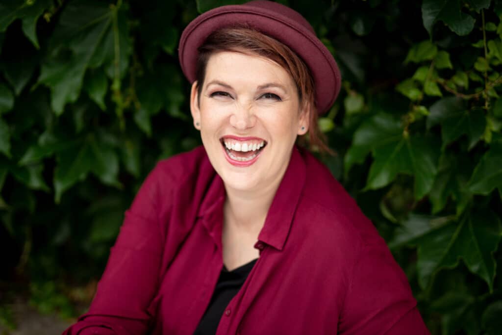
Whilst picking an outfit colour, it is a good idea to keep your industry in mind as more traditional jobs tend to favour a more traditional approach to colour (black, navy, white, grey). That being said, if the goal of your corporate headshot is to stand out in a conservative environment, going against the grain with bright, punchy colours can also be effective and make your headshot are memorable.


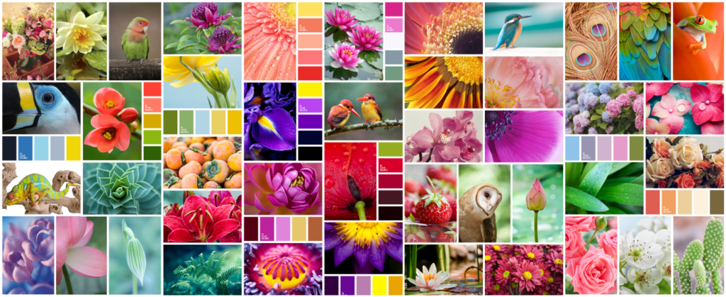
9. Look to Nature for Inspiration
You only need to look at a flower arrangement, fruit bowl or in the sky at different times of the day to see colour harmonies in action. Reds with greens, green with lavender, soft blue with pink or orange.
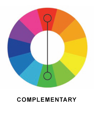
10. Do you want to create Harmony or Tension?
Believe it or not, you can achieve harmony or tension with deliberate use of colour.
Colours closer to one another on the colour wheel will yield a softer look, those directly opposite will provide the contrast, whilst remaining complimentary.
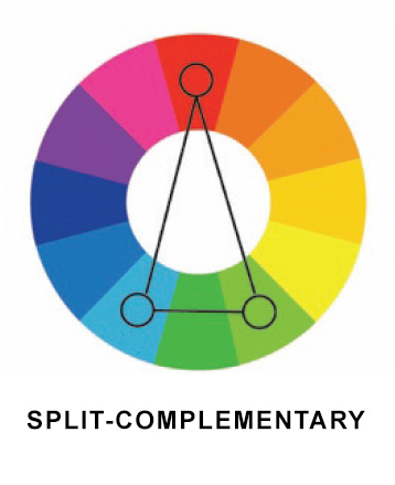
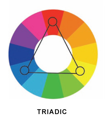
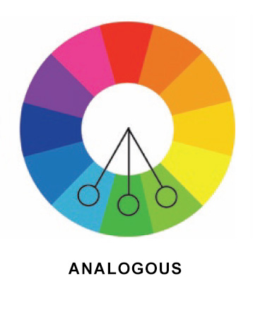
Your industry and career objectives will often help to determine the level of emotional response you’d like from your headshot.
If you are a therapist for instance, going for a monochromatic or analogous colour scheme will be more effective at creating a sense of peace.
It’s worth remembering that your clothing and accessories may only make up part of the colour harmony in your headshot.
The background choice, your eye colour as well as the colour temperature of the light will also play a part in your overall colour scheme and should factored in.


11: Colour Psychology
Colours also have meanings which can add additional layers to any headshot. There’s a reason why many corporate logos focus on dark blue as a core colour. Colour psychology is known to vary from country to country but generally for western countries, the below colour meanings and inferences hold true.
- Blue: Dependable, calm, trustworthy, loyal
- Black: Mysterious, ambiguous
- White: Pure, perfect, innocent
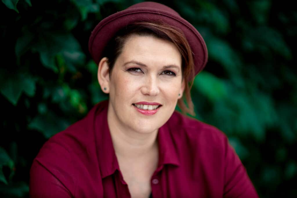
- Red: Passionate, determined, energetic
- Yellow: Happy, intellectual
- Orange: Optimistic, sociable
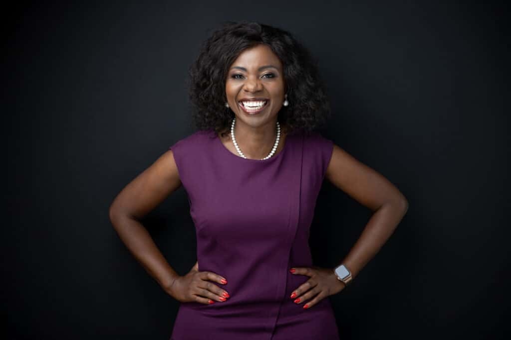
- Purple: Royal, imaginative
- Gold: Successful, luxurious
- Green: Nature, growth
- Pink: Girly, playful, nurturing, loving
- Pink: Brown: Earthy, secure
- Gray: Cool, unemotional
12: Flashes of colour
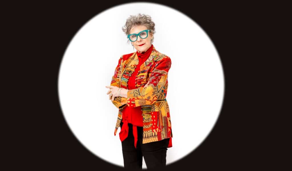
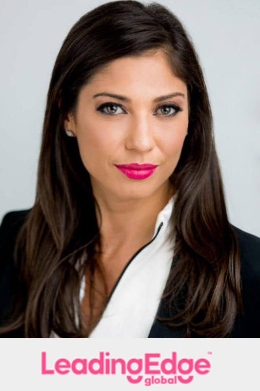
You can use colours to accent your eyes or a brand colour.
Referencing your brand colour with a subtle flash of a similar colour can be highly effective and will create a greater sense of balance on a website when headshots are featured on the same page as a logo. Think necktie, belt, earrings, lipstick, pocket square for subtle references or outer garments for a more obvious connection.
Be careful not to overdo this as it can come across as cheesy.


Colour Selection for Professional Headshots Based on Specific Groups
Here, we’ll delve into what colours best suit different types of professional settings—business, corporate, and casual—ensuring your headshot is not only visually appealing but also strategically effective.
Professional Business Headshots
For business headshots aimed at conveying authority and professionalism, consider these color recommendations:
- Navy Blue: This colour is universally associated with professionalism, reliability, and trustworthiness. It’s a safe and effective choice for nearly any business context.
- Charcoal Grey: Offers a blend of sophistication and formality without being as severe as black. It’s versatile across various professional fields.
- Black: Powerful and timeless, black suits formal business environments but should be balanced with a lighter shirt or blouse to soften it’s intensity.
Tip: Incorporate a pop of colour through accessories such as ties or scarves to add a personal touch without detracting from the professional tone.
Professional Corporate Headshots
Casual professional headshots allow for more personal expression, making them ideal for industries like creative arts or technology:
- Brighter Colors: Will convey creativity and energy, choose vibrant but not overwhelming colors. Shades like deep green, maroon, or even orange can work well.
- Pastels: Light pastels like baby blue, soft pink, or mint green are often flattering and suggest peace, approachability and friendliness.
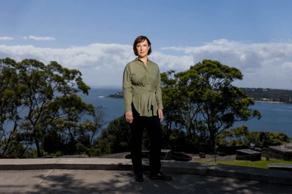
- Earthy Tones: Colors inspired by nature, such as greens, browns, and tans, suggest warmth and reliability, suitable for more laid-back professional settings with a down-to-earth feeling.
Tip: Layers and textures can add depth and interest to casual headshots, making them stand out while keeping the vibe relaxed.
Professional Casual Headshots
Casual professional headshots allow for more personal expression, making them ideal for industries like creative arts or technology:
- Brighter Colors: Will convey creativity and energy, choose vibrant but not overwhelming colors. Shades like deep green, maroon, or even orange can work well.
- Pastels: Light pastels like baby blue, soft pink, or mint green are often flattering and suggest peace, approachability and friendliness.
- Earthy Tones: Colors inspired by nature, such as greens, browns, and tans, suggest warmth and reliability, suitable for more laid-back professional settings with a down-to-earth feeling.
Tip: Avoid overly bright colours that may clash with typical corporate aesthetics unless they are part of your company’s branding or if your goal is to stand out.
General Tips for All Types of Headshots
- Contrast is Key: Ensure there is a good contrast between your outfit and the background. This helps keep the focus on you.
- Skin Tone Consideration: Choose colors that complement your skin tone. Cool-toned individuals may look best in blues and purples, while warm-toned individuals look best in earthy shades like red and yellow.
- Keep it Simple: Avoid busy patterns and large logos that can distract from your face, the focal point of your headshot.
As a quick test to work out your undertones, take a look at the veins on your inner-wrist (or wherever you can see them through your skin). If they appear towards the blue end of the spectrum, including purple, this is highly indicative of cool undertones. Warm skin tones typically show veins as green.
Key Factors for Choosing Colors in a Professional Headshot
When selecting colours for your professional headshot, consider these key factors:
Factor 1 – Skin Complexion
Your skin complexion is the overall hue and radiance of your skin. It’s essential to consider your complexion when choosing colours for a professional headshot. Colours that complement your natural skin tone can enhance your features and create a flattering appearance that looks balanced. Avoid colours that clash or wash out your complexion, as they can make you appear sickly.
Factor 2 – Skin Tone
Skin tones can be broadly categorised into warm, cool, and neutral undertones. Understanding your skin tone is crucial for selecting colours that harmonise with your natural hues.
- Warm Skin Tones:
If you have a warm skin tone with hints of yellow, peach, or golden undertones, you may look best in earthy, warm-toned colours like terracotta, burnt orange, or olive green. These colours can bring out the warmth in your complexion and create a radiant, healthy glow.
- Cool Skin Tones:
Cool skin tones have a pinkish or bluish undertone. Colours like lavender, plum, or cool greys can complement these skin tones beautifully, enhancing your natural colouring and creating a fresh, vibrant look.
- Neutral Skin Tones:
Neutral skin tones lack a distinct warm or cool undertone, making them versatile for a wider range of colours. Consider classic shades like navy, burgundy, or rich browns, which can provide depth and contrast without overwhelming your complexion.
Factor 3 – Skin Undertone Colour
Beyond the overall skin tone, it’s important to consider your specific undertone colour. This can range from golden or olive to rosy or blue-based. Identifying your undertone can help you select colours that harmonise with your natural hues, creating a cohesive and flattering look.
Drape a white cloth near your face – if you appear yellowish, you’re warm-toned; pinkish means cool. Certain metals like gold (warm) or silver (cool) can also provide clues. When flushed, rosy tones indicate cooler undertones, while golden hues suggest warmer undertones.
Factor 4 – Hair Colour Considerations
Your hair colour should also be taken into account when choosing colours for your headshot. Look for colours that complement your hair shade without clashing or appearing too matchy. For instance, if you have warm, golden-toned hair, you may want to choose warm-toned clothing colours like deep reds or oranges. Cooler hair colours often pair well with blues, purples, or cool greens.
Factor 5 – Background Colour
The background colour in your headshot will also impact the overall look and feel. Neutral or complementary colours are always a safe option for any industry, whilst bold or contrasting colours can make a statement and speak to a specific identity. Incorporating your brand colours or choosing a backdrop that compliments your outfit and complexion for a harmonious, visually appealing headshot.
Final Words
Colour can be a powerful weapon in your corporate headshot arsenal and it pays to consider your colours (even if you intend to have black and white business headshots!)
They make a difference in how well your pictures appear, stand out on a page and ensure that they send out the right brand message.
You can check out our professional headshot gallery and editorial portraits for inspiration on colour.
Plus loads more inspiration on our Hero Shot Photography website
Frequenty Asked Questions
Stick to solid, neutral colours like blue, grey, or burgundy that complement your skin tone. Avoid busy patterns or bright colours that can be distracting.
A friendly, natural smile can make you appear approachable, but a serious expression can convey professionalism. When deciding, consider your industry and personal brand.
Choose a neat, polished hairstyle and natural-looking makeup that enhances your features without being overdone or distracting.
While still looking professional, you can showcase more personality in creative fields. Consider adding a pop of colour or an accessory that aligns with your brand.
Selfies generally lack the proper lighting, background, and quality needed for a professional headshot. It is recommended that you invest in a skilled photographer.
Prices can range from $150 to $500 or more, depending on the photographer’s experience, location, and package inclusions.
Choose well-fitting, solid-coloured clothing that flatters your body shape. Avoid busy patterns or overly tight or loose garments.
A clean, neutral background like grey or beige can create a professional, timeless look. Alternatively, incorporate brand colours or complementary hues.
Yes, a high-quality professional headshot can be used consistently across various platforms and marketing materials.
Minor retouching to even skin tones, removing blemishes, and enhancing lighting is acceptable. However, avoid excessive editing that drastically alters your appearance.


