


Linkedin says that profiles with a headshot get 21x more profile views however, the deliberate use of colour can take your headshot to a whole new level.
When it comes to creating a perfect headshot, an often overlooked component is the selection colour to complement yourself, your brand or both.
Correct use of colour can make you appear slimmer, more confident, empathetic, trustworthy and in many cases more relatable.
Read below to find out how you can use colour theory and colour psychology for maximum impact in your next headshot.
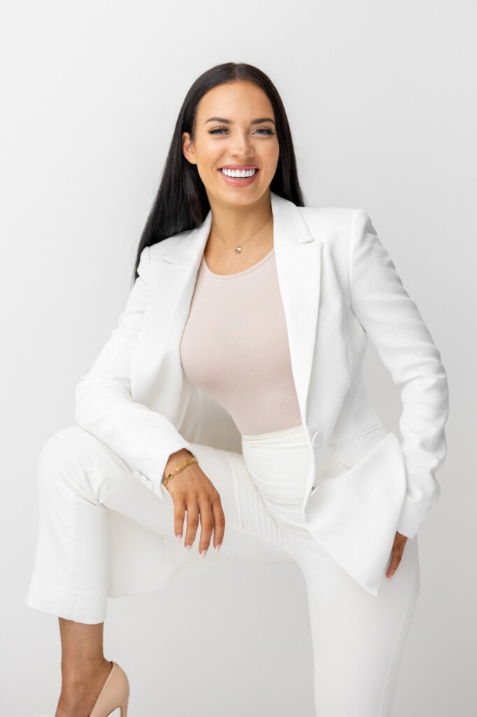
1. Neutral or Solid Colours
Solid and neutral colours always work well as the eye is used to seeing them and they have little chance of overwhelming the frame. Light neutral shades include white and cream, while dark ones include navy and black.
Neutrals are timeless, non-competing and emotionless.
They can either be used alone for a soft understated look or as a base colour along another colour palette as they will go well with most other colours.
As neutrals don’t evoke emotion of their own, they can also help to highlight an expression or smile.
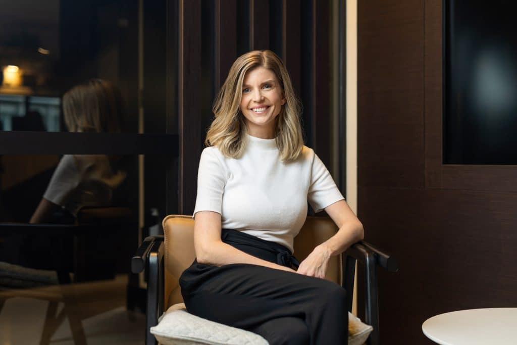


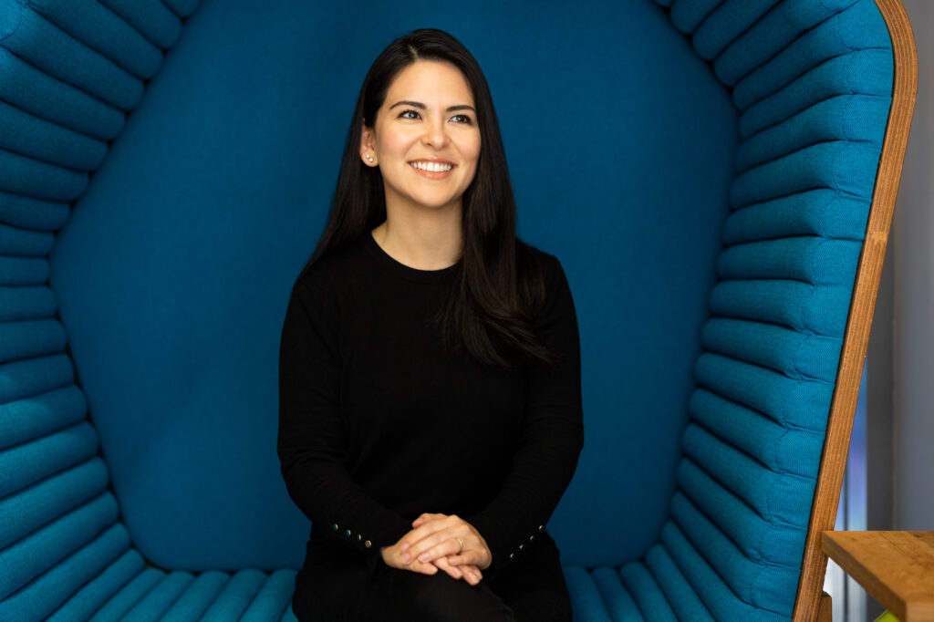
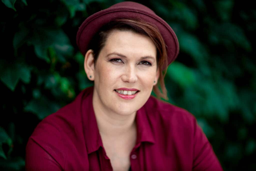
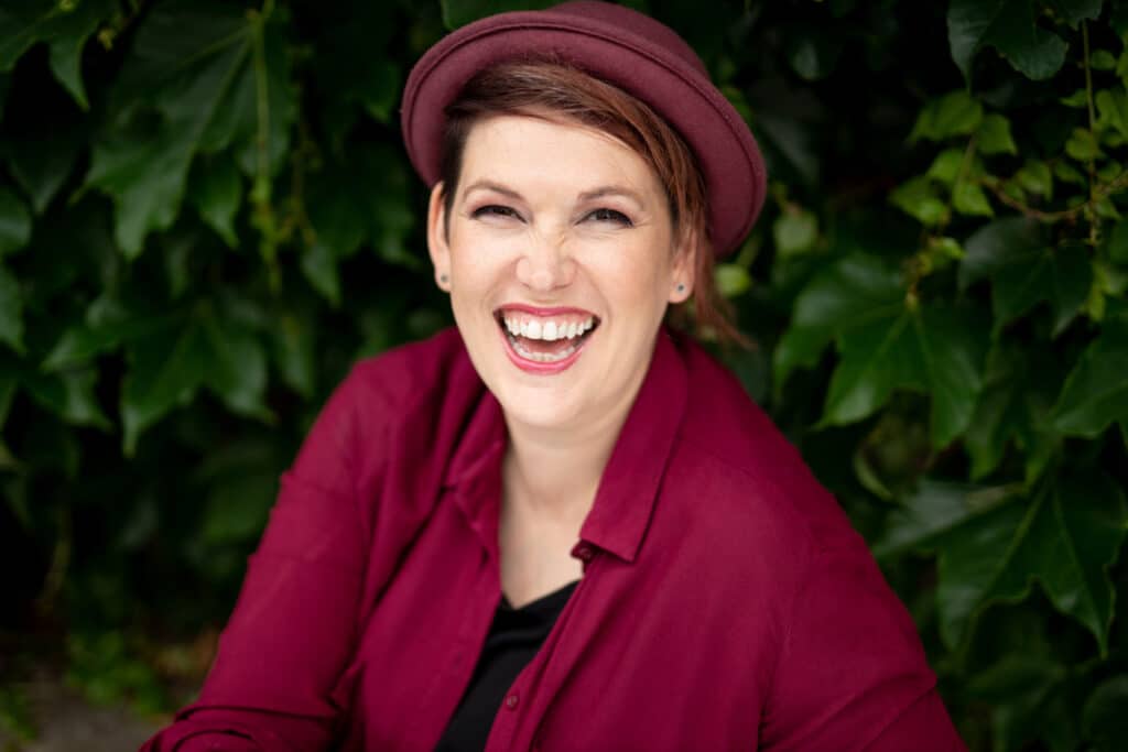
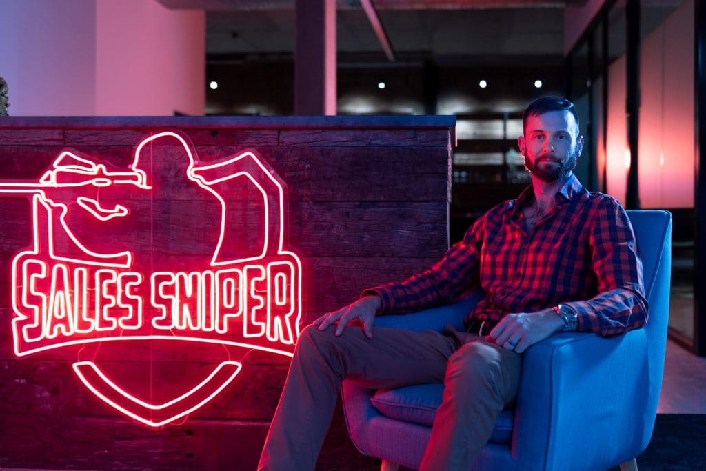
2. Bold Shades around the Neckline
Darker shades surrounding the neckline, such as the lapel of a blazer or the neckline of a top itself will help you draw focus to the face. This is often advised over wearing a distinctive necklace, which will normally compete for attention instead of directing attention elsewhere.

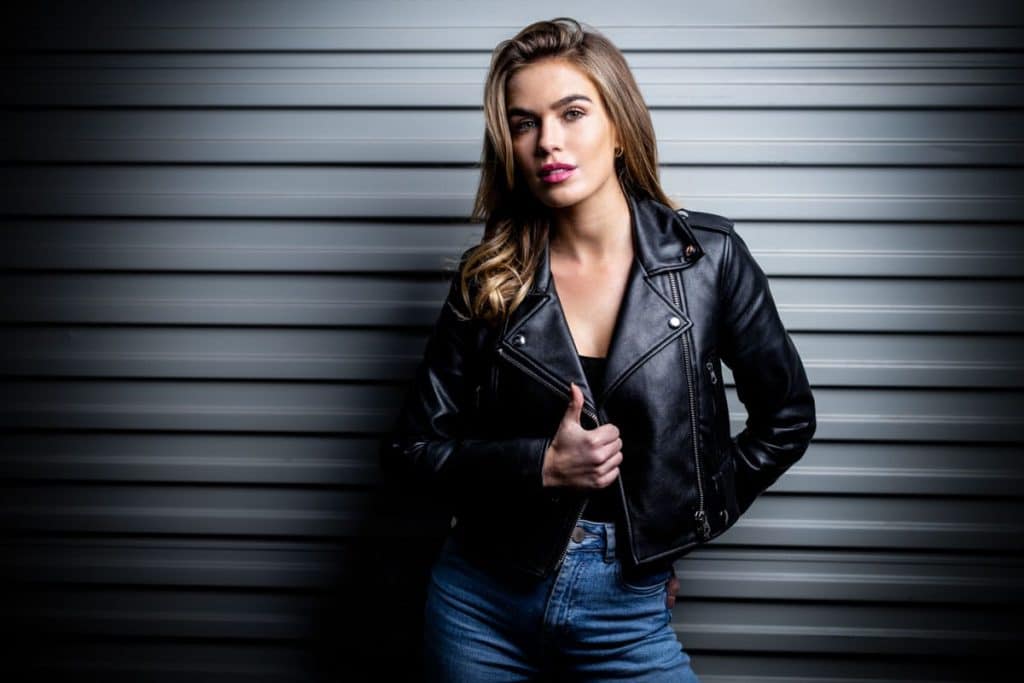


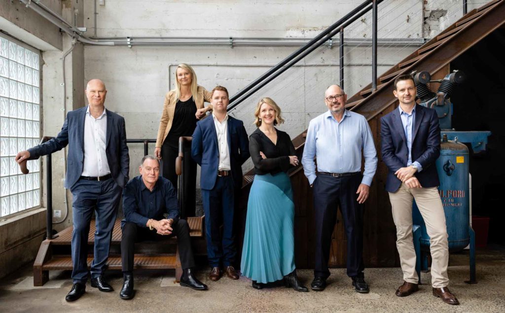
3. Classics Always Rock
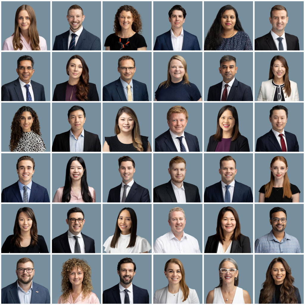
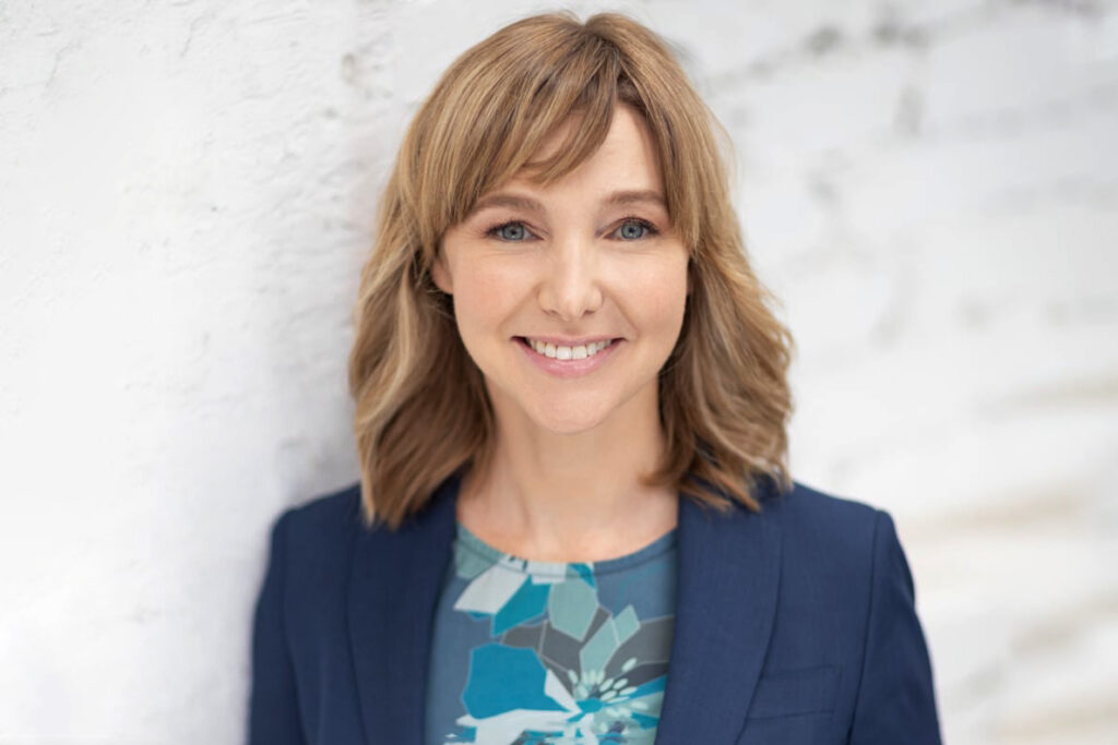
Classic business clothing options for a professional headshot, such as navy, blue, black and dark grey look good on practically anyone. Classics, however, are very much industry dependent. Lawyers, financial services and other traditional, conservative industries tend to prefer understated, darker outer options whilst artists and designers are not so confined by a monochrome colour palette.
More examples of Professional Headshot Photography


4. Black and White Photography
If you plan to use black and white photography, we recommend you to opt for contrasting colours and tonality. For example, a bright, white-coloured shirt with tie and navy-blue blazer will work well.
A pastel top with a light grey jacket won’t translate so well into black and white due to the lack of contrast.
Once colour has been removed from the image, the tonality of the clothing will also be more like the skin tone so it will lack overall punchiness.


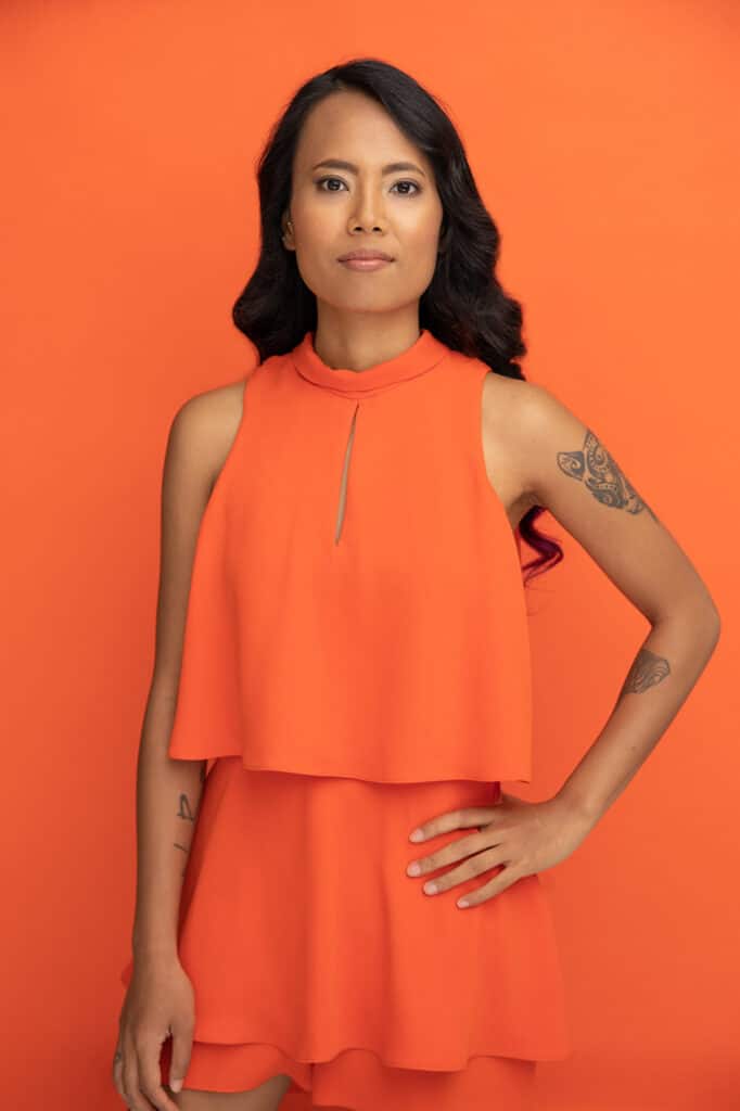
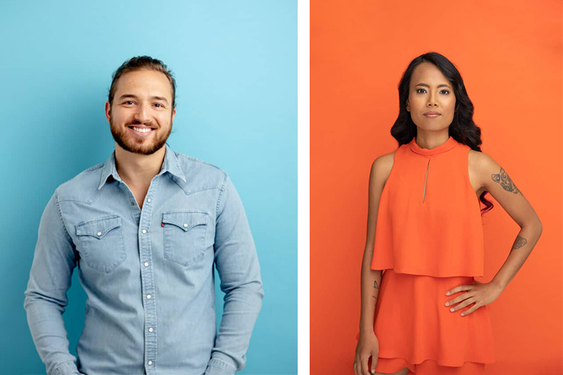
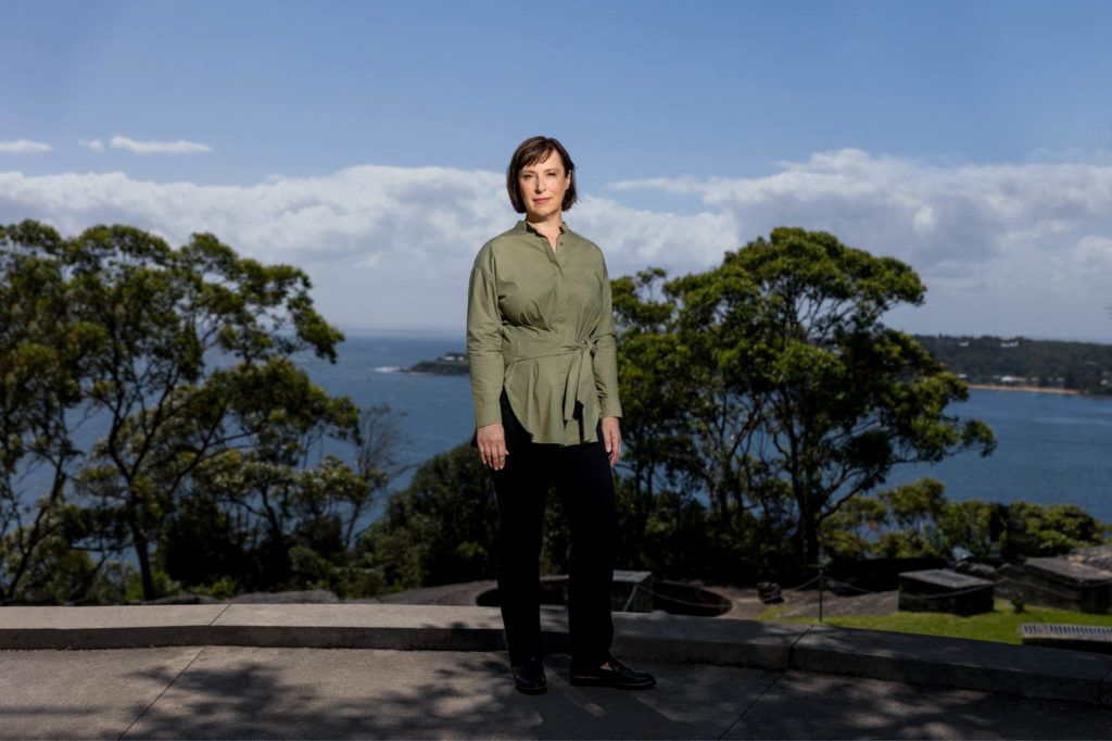
5. Deeper Colours Pop
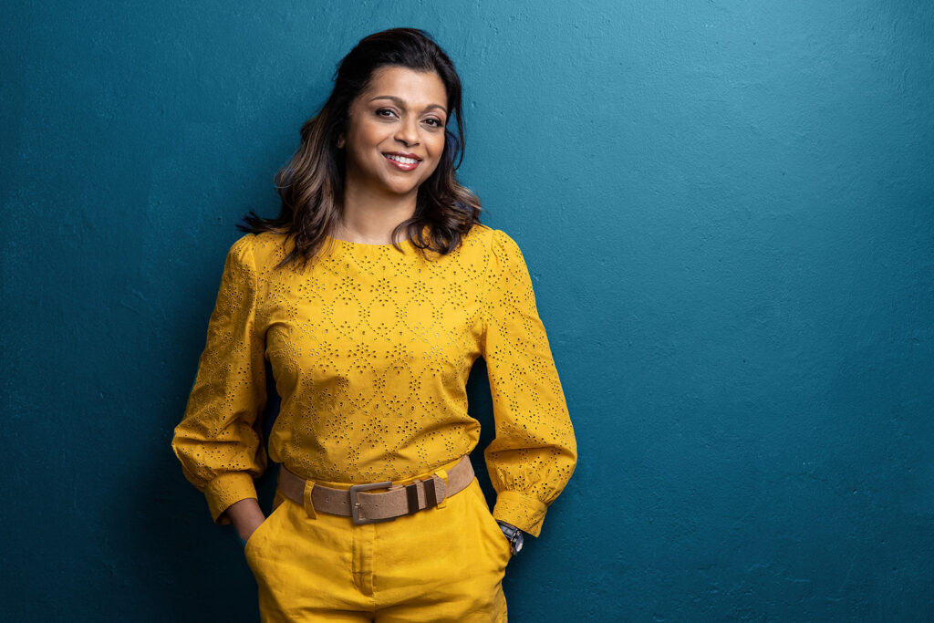
Instead of picking white, yellow, and other pale colours, for outdoor headshot sessions, consider bringing some deep colours. They will help you reduce the amount of light reflecting from them and ensure you do not appear washed out.

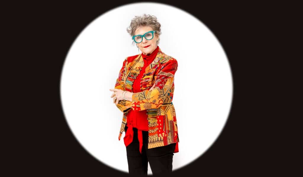
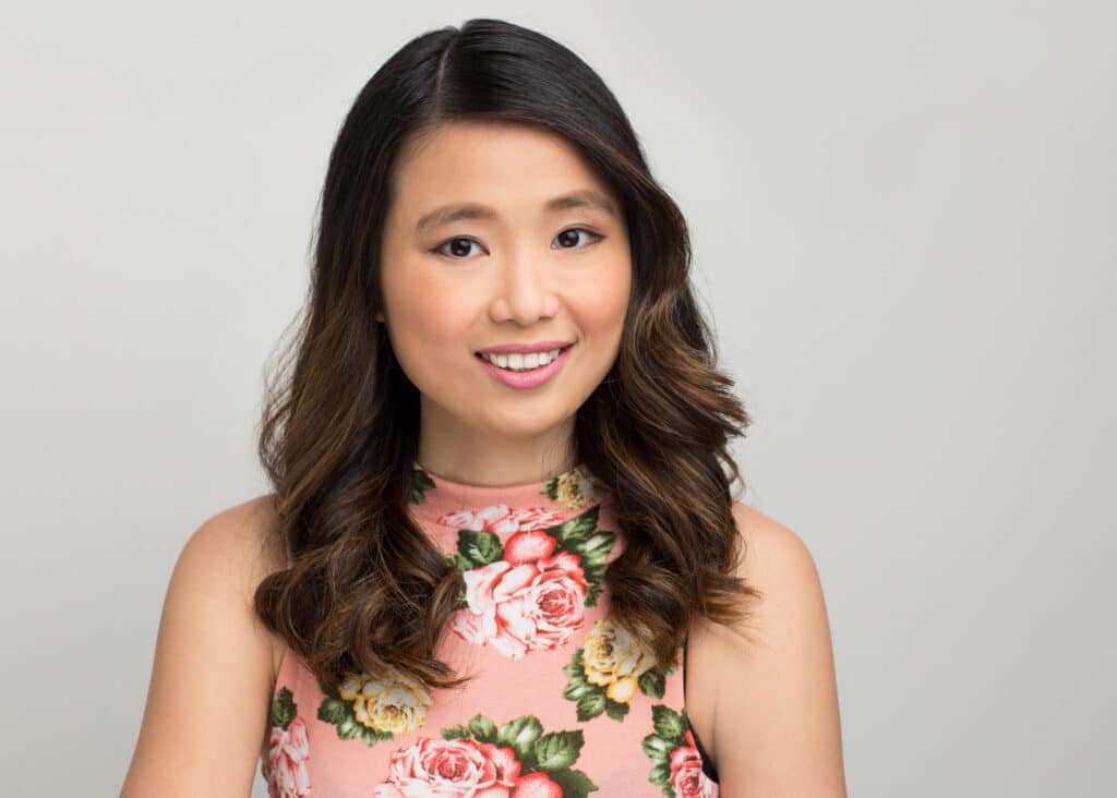
6. Avoid Graphics and Patterns
We always recommend choosing a shirt or blouse of solid colours instead of something with a bold or graphic pattern. For branding photo shoots, it will help you highlight the company logos and slogans, and professional headshots will be more focused on the individual, without creating any distractions.
This isn’t to say that busy patterns can’t still be worked with, they just reduce your options both in terms of your shoot including backgrounds and final usage of the images. It’s therefore generally better bang for your investment to consider plainer options first.
*For group portraits, patterns are almost always best avoided
7. While Layering Wear Complementary Shades
Layers help to add more interest but make sure that the colour combinations that you wear when layering complement each other. We advise keeping the colour combinations simple.


Matching your eye colour with a similar dominant or secondary colour will also make for more visually appealing colour palette.
Look at some of our favourite colour combinations below:
| Colour | Goes well with |
| Red | Dark brown, purple, light green
|
| Yellow
|
Light blue, red, black, and dark blue |
| Blue
|
White, pale green, dark green, and dark red |
| Green
|
Dark purple, dark green, black, and dark blue |
| Pink | Red, black, grey, and blue |
| Teal
|
Peach, dark blue, dark green, and dark red |
| Purple
|
Pale green, red, pale purple, and dark blue |
8. Consider your Goals and your Industry
Whilst picking an outfit colour, it is a good idea to keep your industry in mind as more traditional jobs tend to favour a more traditional approach to colour (black, navy, white, grey). That being said, if the goal of your corporate headshot is to stand out in a conservative environment, going against the grain with bright, punchy colours can also be effective and make your headshot are memorable.


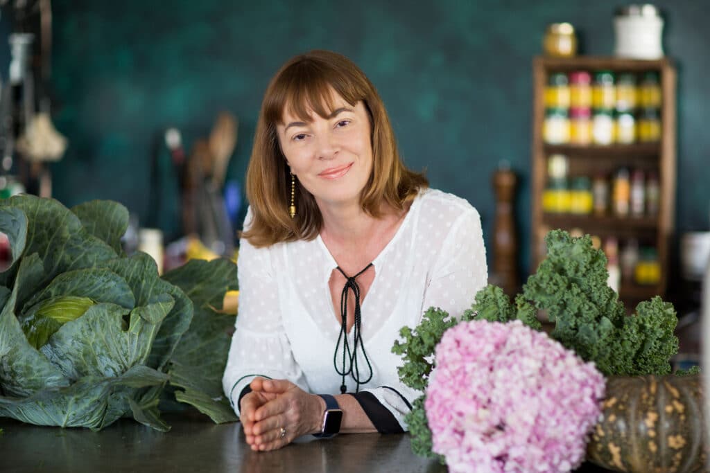


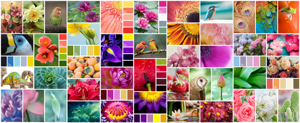
9. Look to Nature for Inspiration
You only need to look at a flower arrangement, fruit bowl or in the sky at different times of the day to see colour harmonies in action. Reds with greens, green with lavender, soft blue with pink or orange.
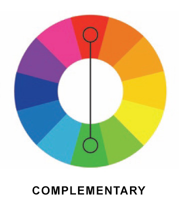
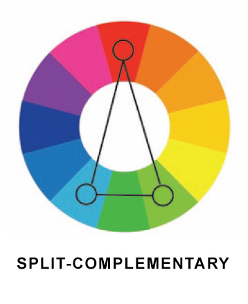
10. Do you want to create Harmony or Tension?
Believe it or not, you can achieve harmony or tension with deliberate use of colour.
Colours closer to one another on the colour wheel will yield a softer look, those directly opposite will provide the contrast, whilst remaining complimentary.
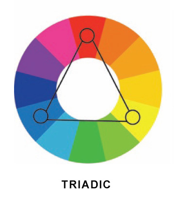
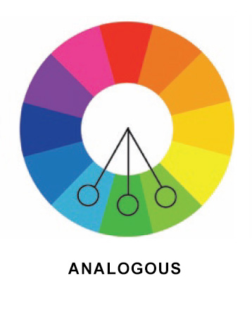
Your industry and career objectives will often help to determine the level of emotional response you’d like from your headshot.
If you are a therapist for instance, going for a monochromatic or analogous colour scheme will be more effective at creating a sense of peace.
It’s worth remembering that your clothing and accessories may only make up part of the colour harmony in your headshot.
The background choice, your eye colour as well as the colour temperature of the light will also play a part in your overall colour scheme and should factored in.


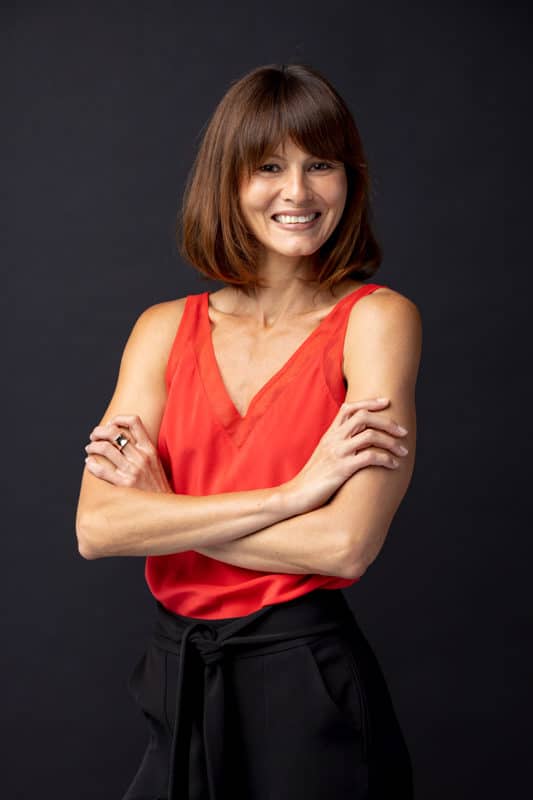
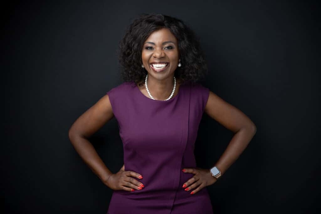
11: Colour Psychology
Colours also have meanings which can add additional layers to any headshot. There’s a reason why many corporate logos focus on dark blue as a core colour. Colour psychology is known to vary from country to country but generally for western countries, the below colour meanings and inferences hold true.
- Blue: Dependable, calm, trustworthy, loyal
- Black: Mysterious, ambiguous
- White: Pure, perfect, innocent
- Red: Passionate, determined, energetic
- Yellow: Happy, intellectual
- Orange: Optimistic, sociable
- Purple: Royal, imaginative
- Gold: Successful, luxurious
- Green: Nature, growth
- Pink: Girly, playful, nurturing, loving
- Brown: Earthy, secure
- Gray: Cool, unemotional
12: Flashes of colour
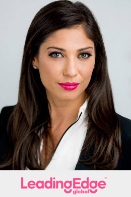
You can use colours to accent your eyes or a brand colour.
Referencing your brand colour with a subtle flash of a similar colour can be highly effective and will create a greater sense of balance on a website when headshots are featured on the same page as a logo. Think necktie, belt, earrings, lipstick, pocket square for subtle references or outer garments for a more obvious connection.
Be careful not to overdo this as it can come across as cheesy.


Final Words
Colour can be a powerful weapon in your corporate headshot arsenal and it pays to consider your colours (even if you intend to have black and white business headshots!)
They make a difference in how well your pictures appear, stand out on a page and ensure that they send out the right brand message.
You can check out our professional headshot gallery and editorial portraits for inspiration on colour.


